|
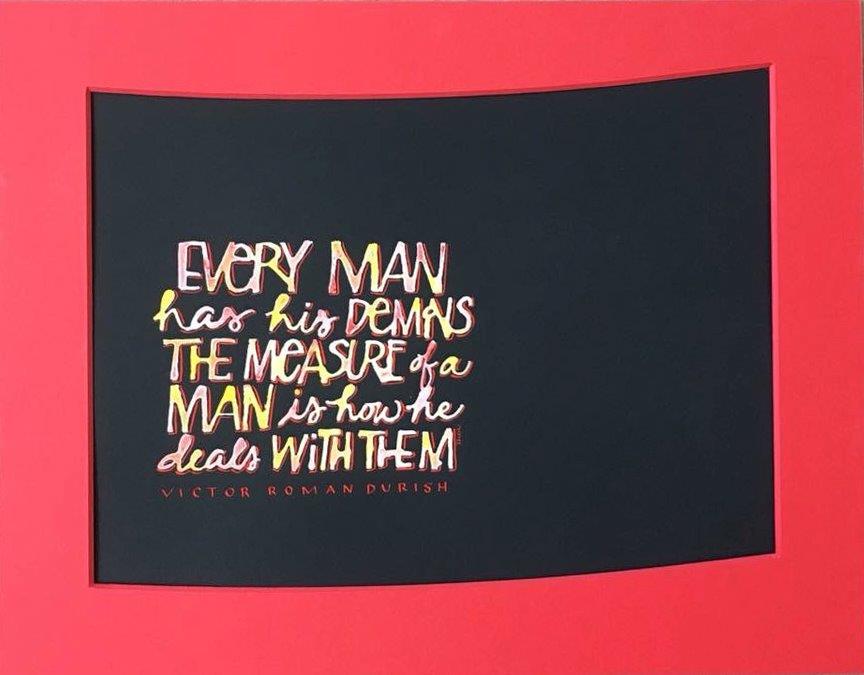
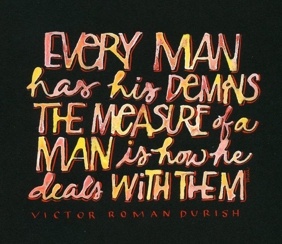
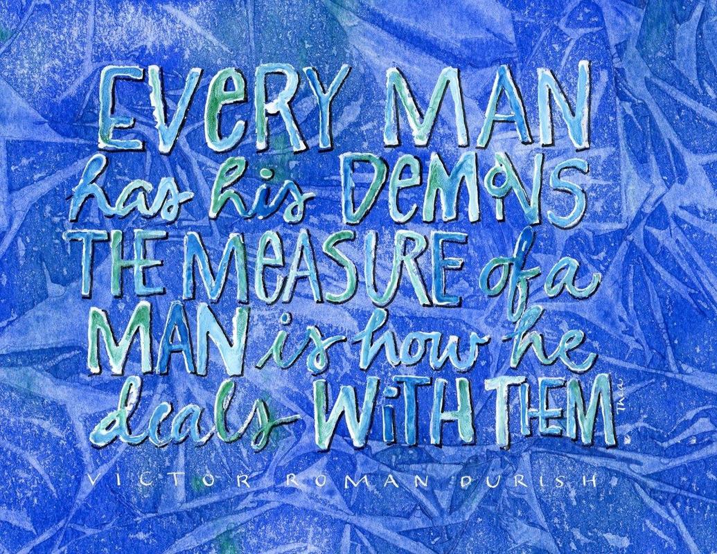
I am always interested to see what happens when you do a piece in different colours and how it changes when you add a mat. Here is a perfect example. This quote blends in too much on the blue background but really packs a punch on black and even more so when it is matted. I love the unusual mat that Karen of Time Frames cut.  Another happy matting choice, also done by Karen at Time Frames. This was part of my Christmas Card.
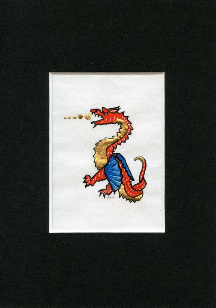
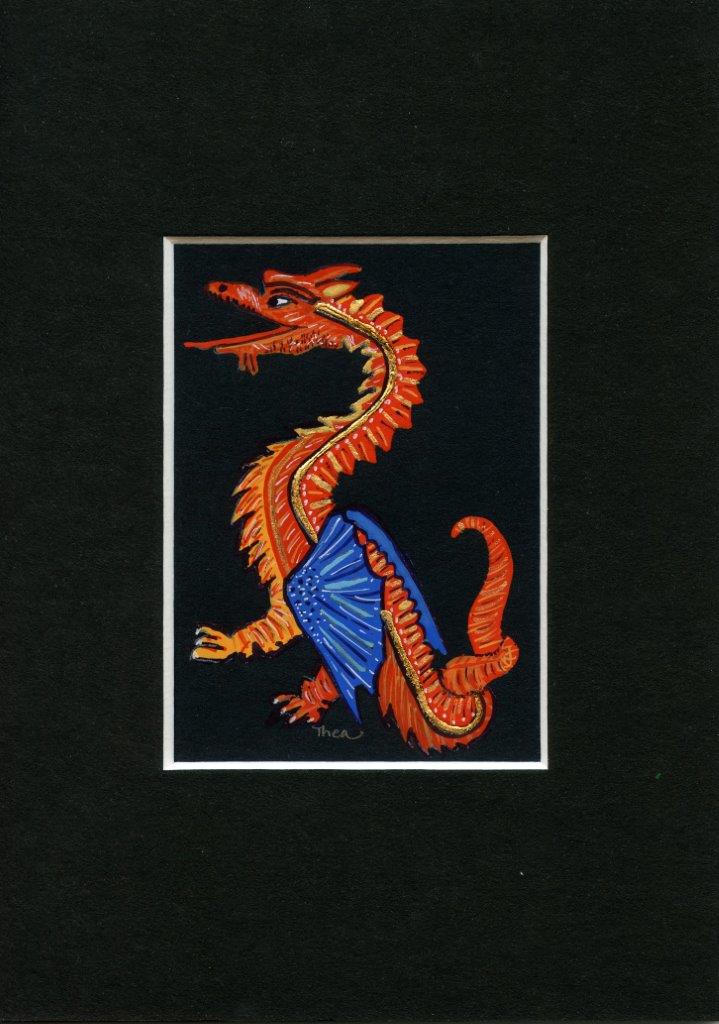
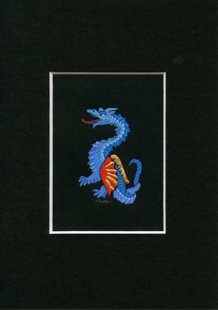
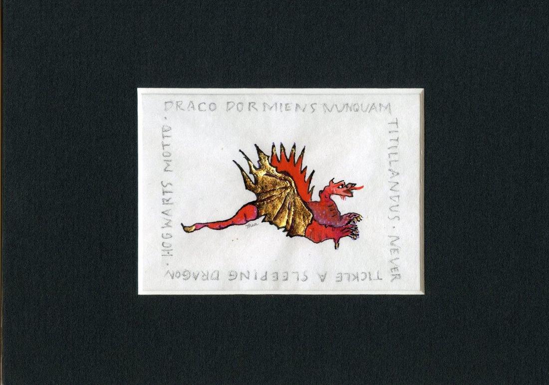
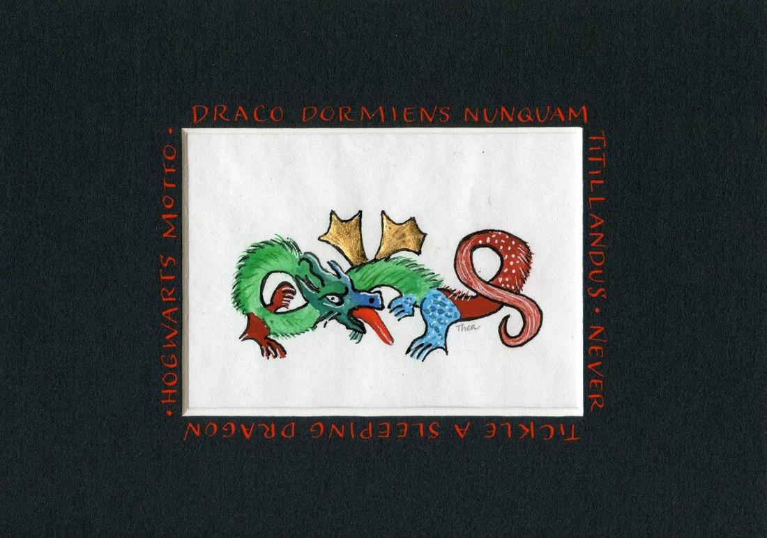
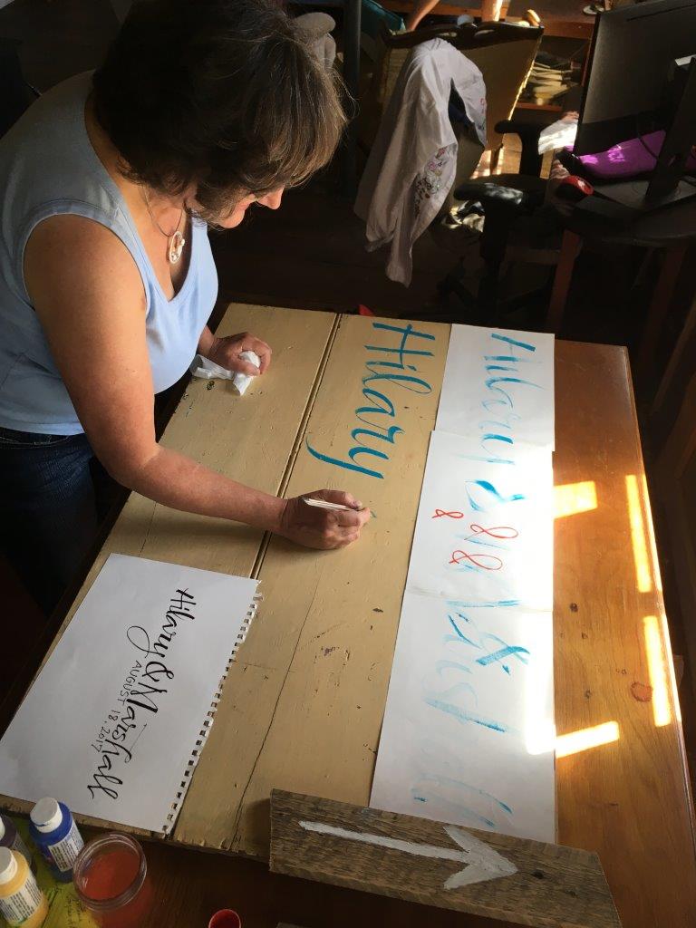
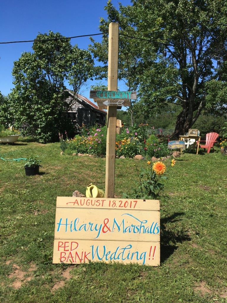
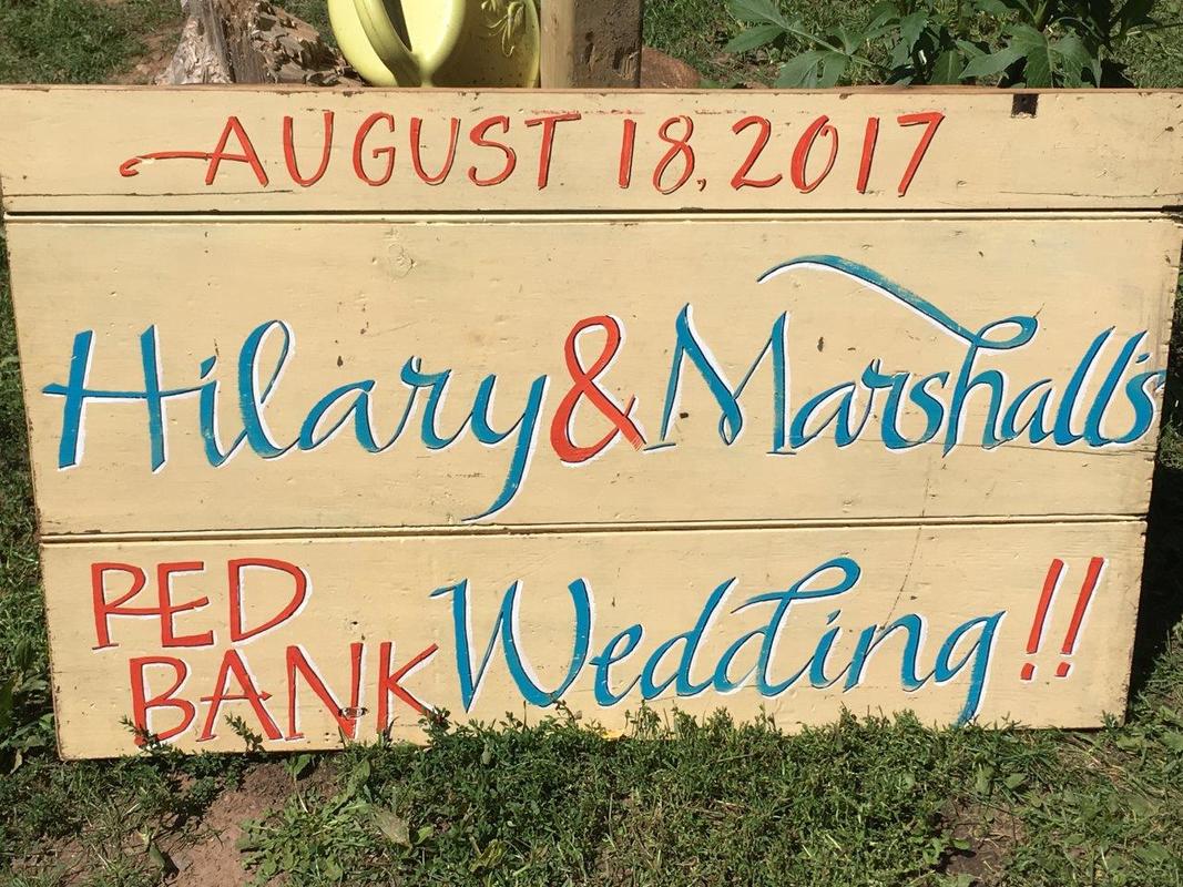
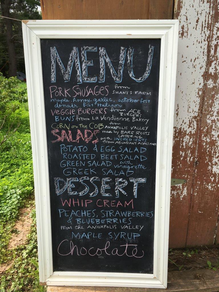
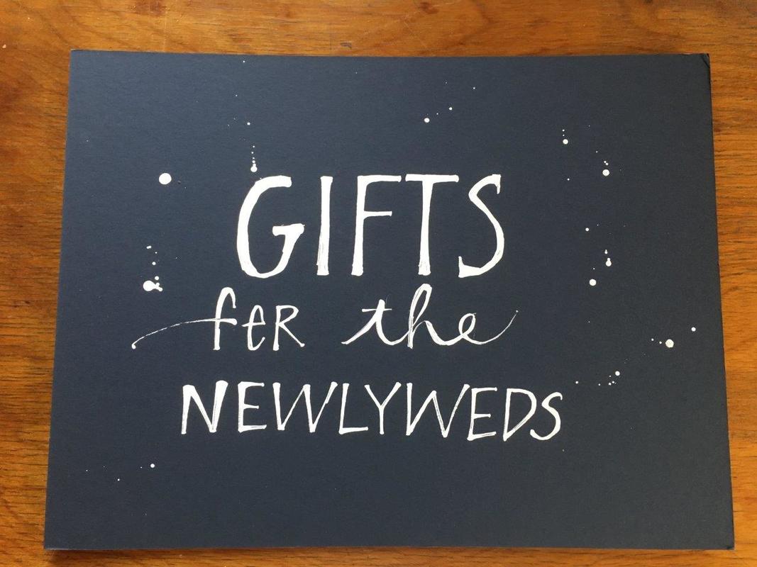
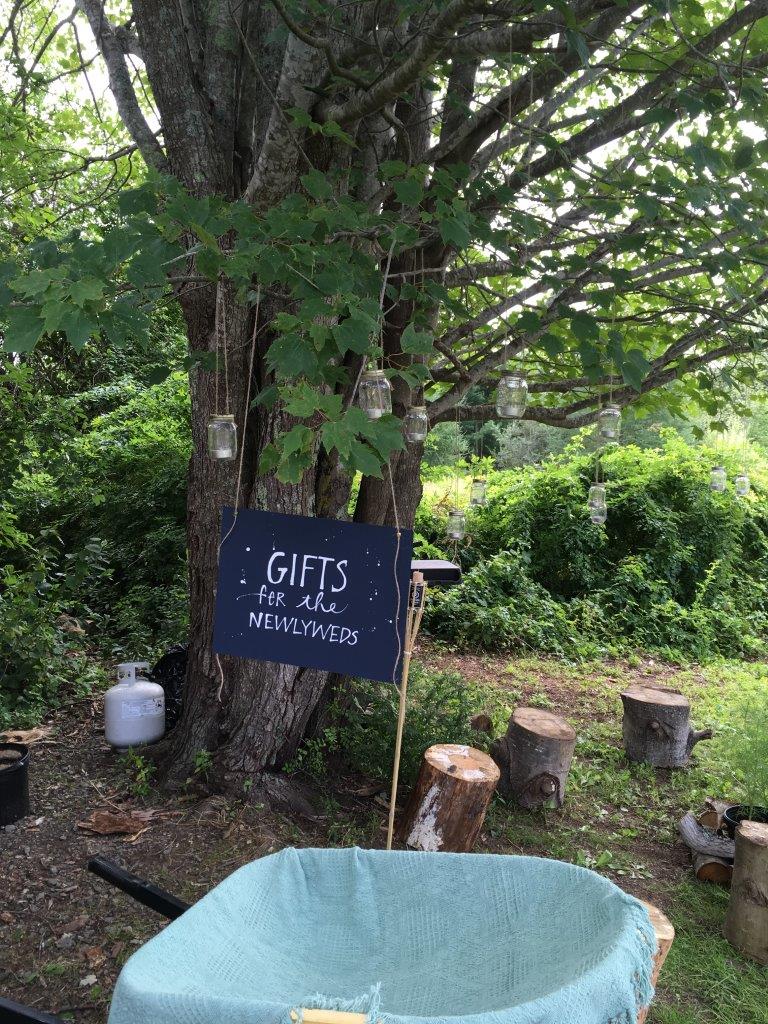
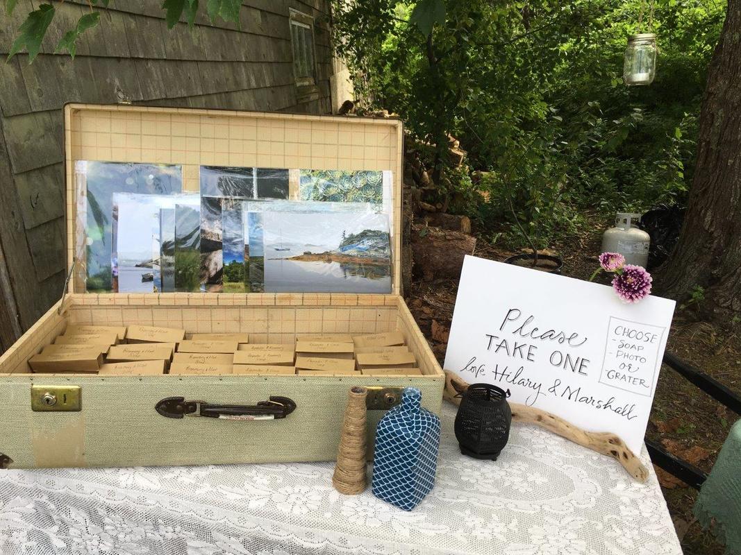
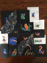 Illuminated Medieval Dragons! I researched these dragons on-line and experimented with how they looked on white paper (linen paper from St. Armand's in Montreal), black paper, and in different sizes. I love how they turned out when they're matted. 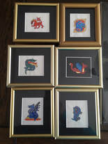 Karen Rodrigue of Time Frames Custom Picture Framing did a great job of making perfect little frames! The same dragon on white, black and larger and then matted. Click on each image to see it full size. The mats are 5 x 7 with approximately 2 1/2 x 3 1/2 inches. I enjoyed adding this quote around the dragon and right on the mat. I loved creating these signs and chalkboards for Hilary and Marshall! They had an amazing wedding at their 200 year old farmhouse about an hour from Halifax. These were all created on-site, mostly the day before the wedding. This sign was lettered with acrylic paint on an old board, primarily with a flat brush. My first attempt at chalk boards. More signs, These were written on mat board with a ruling pen or pointed brush.
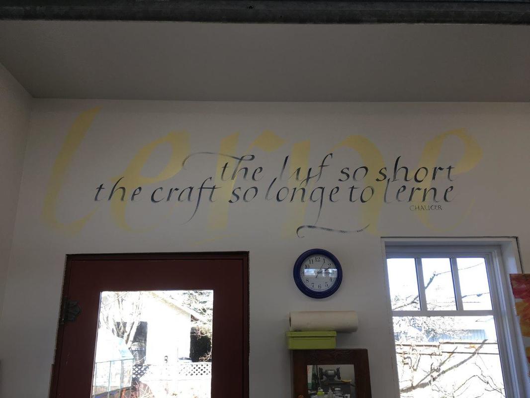
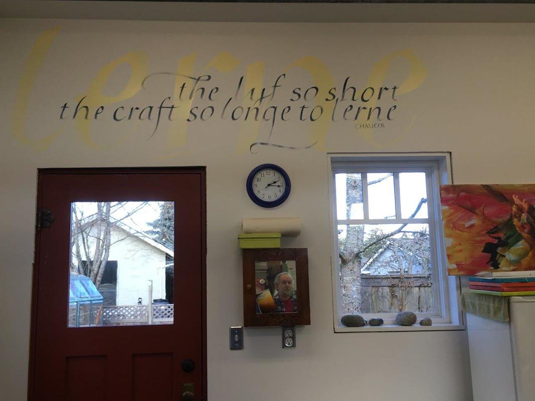
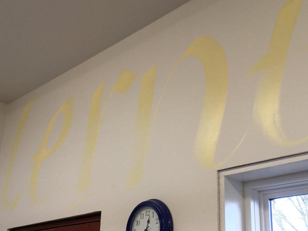
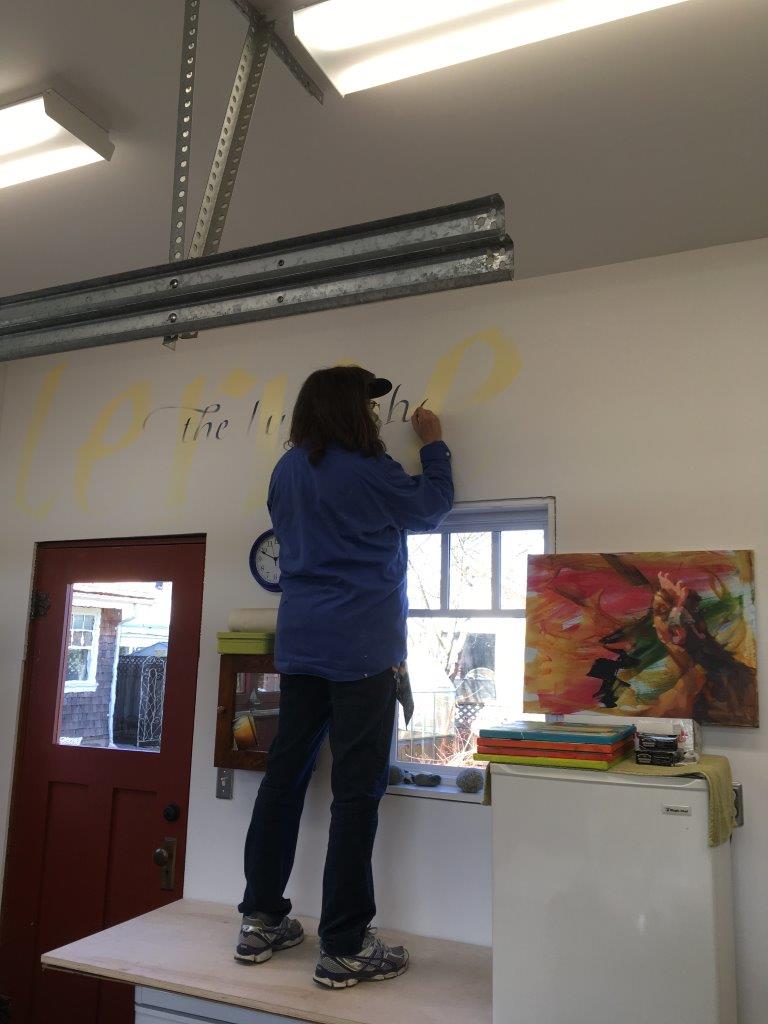
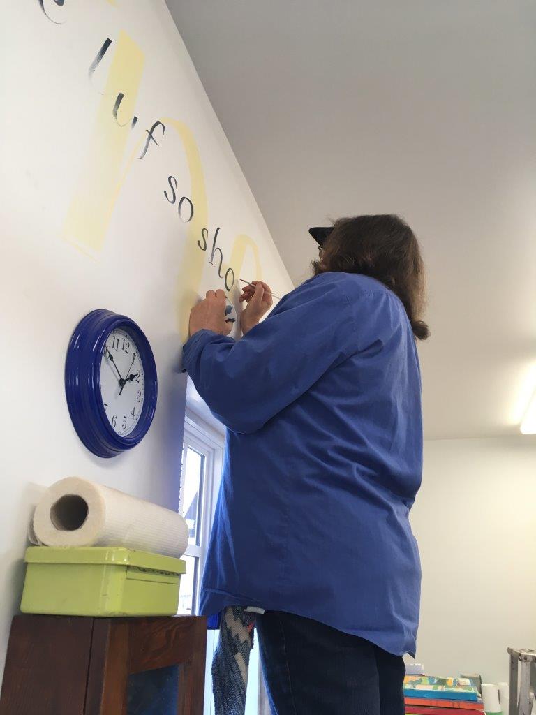
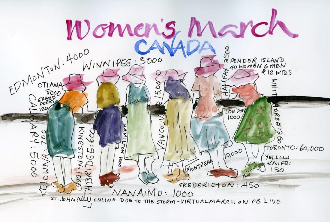
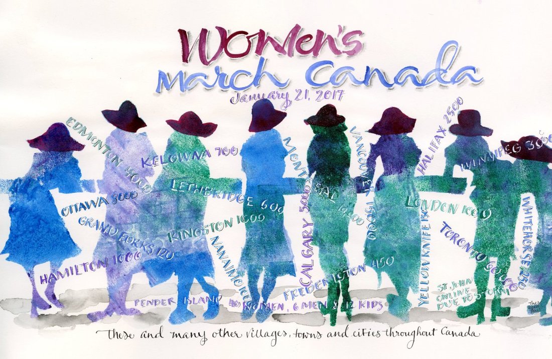
I loved doing this over the door. It is in a large redone garage that is a shop/studio. It may be hard to read until you realize it is from Chaucer. I was very impressed by the support Canadian cities, towns and villages gave to the Women's March which was held January 21, 2017. I created the piece on the left as a trial to see how the ladies and details of the cities and numbers would look, The drawing and lettering were done quickly on a slick paper and painted loosely. I then created the more formal piece on the right. A group of friends created this image from a photograph with all of us in silhouette and I cut a stencil from it. The ladies were painted through the stencil and the lettering added afterwards with a pointed pen and pointed brush. The hats were all painted pink of course! Interestingly many of my colleagues preferred the piece on the left so I have included both.
Merry Christmas and Happy Holidays! I always look forward to creating our family card and this year was especially enjoyable. The background is acrylic paint covered with saran wrap while it dries, which resulted in this wonderful frost. I wrote the words myself and after working out the layout, wrote right on the original using Bleedproof white and Kathy Milici's Modern Storybook Script. I used a vintage "La Banque Provincial du Canada" nib that I found in PEI this fall. 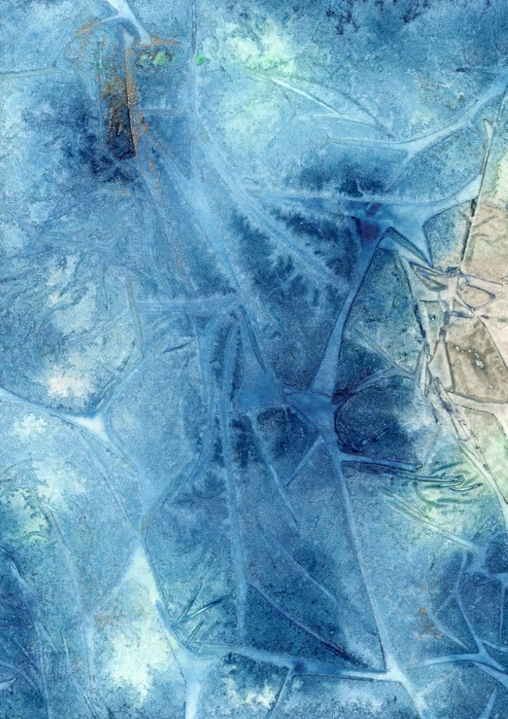 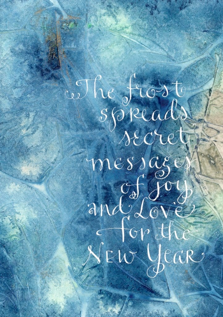 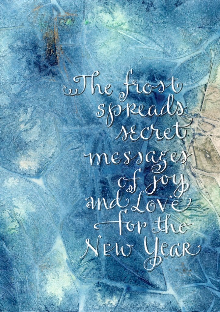 The background, the writing before shadowing, and the finished piece.
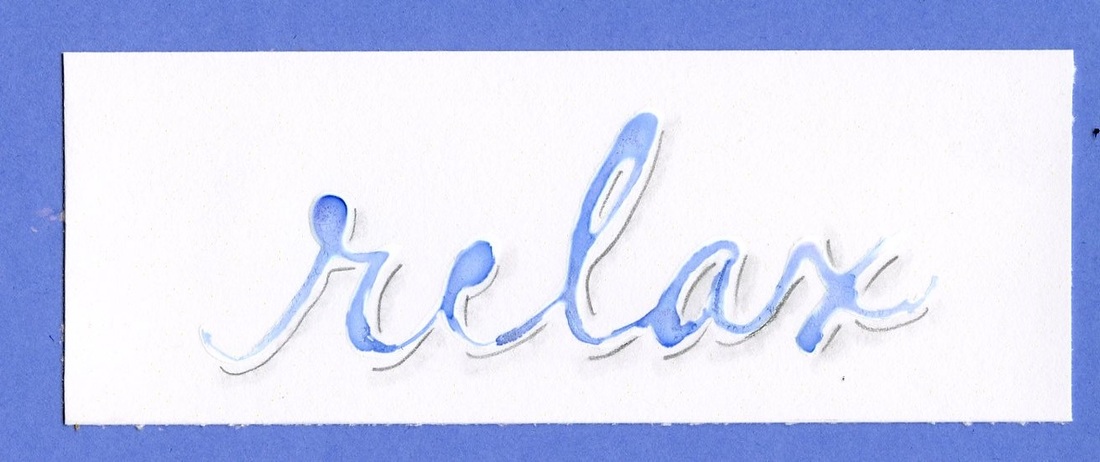
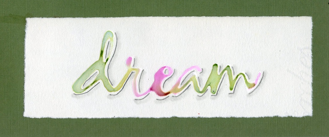
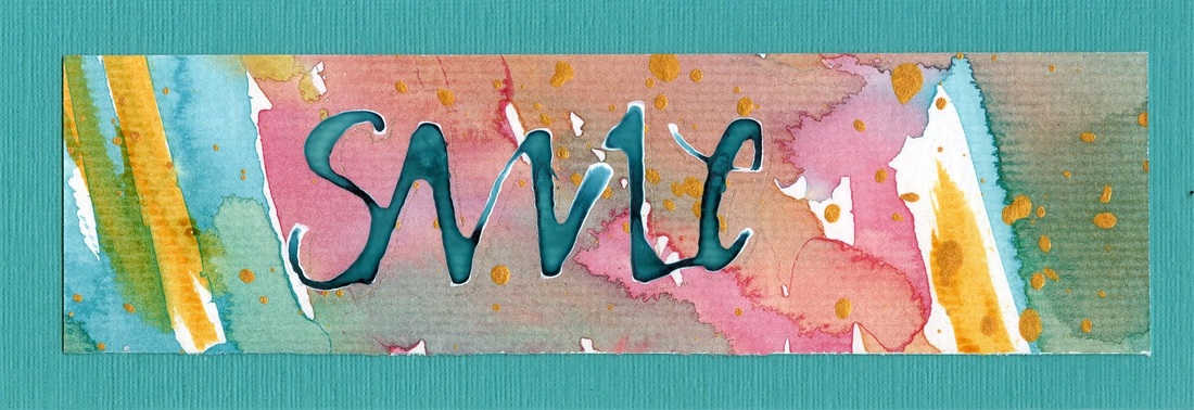
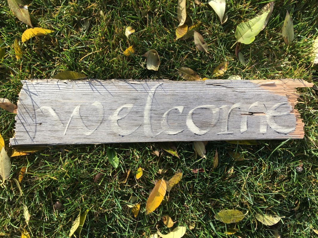
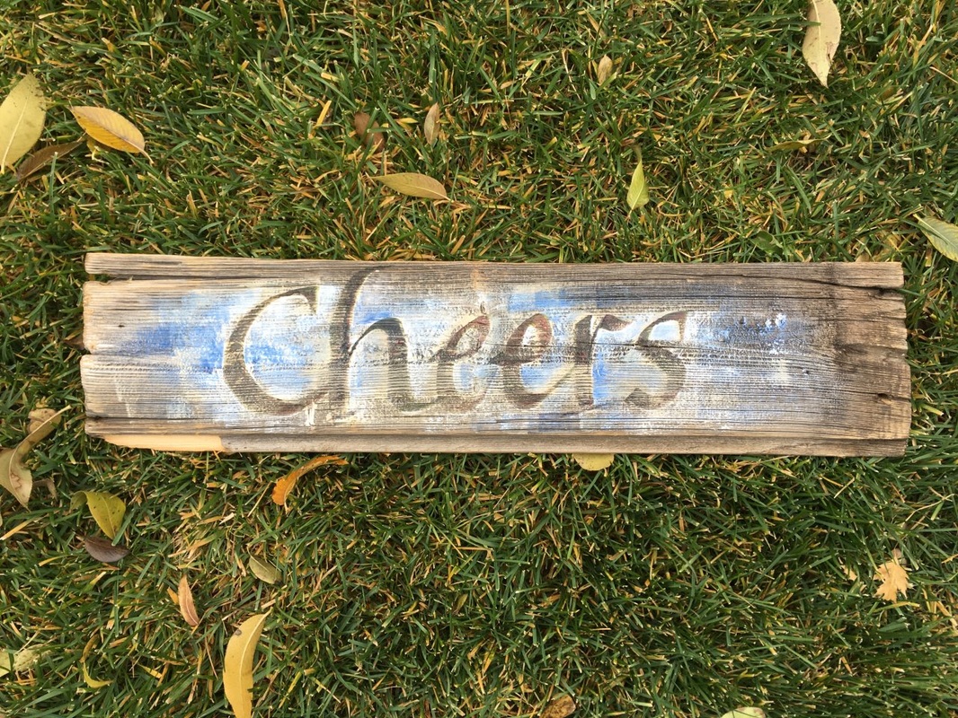
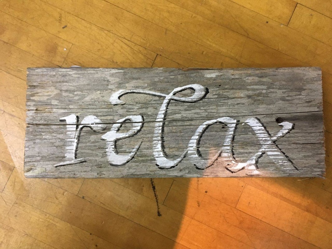
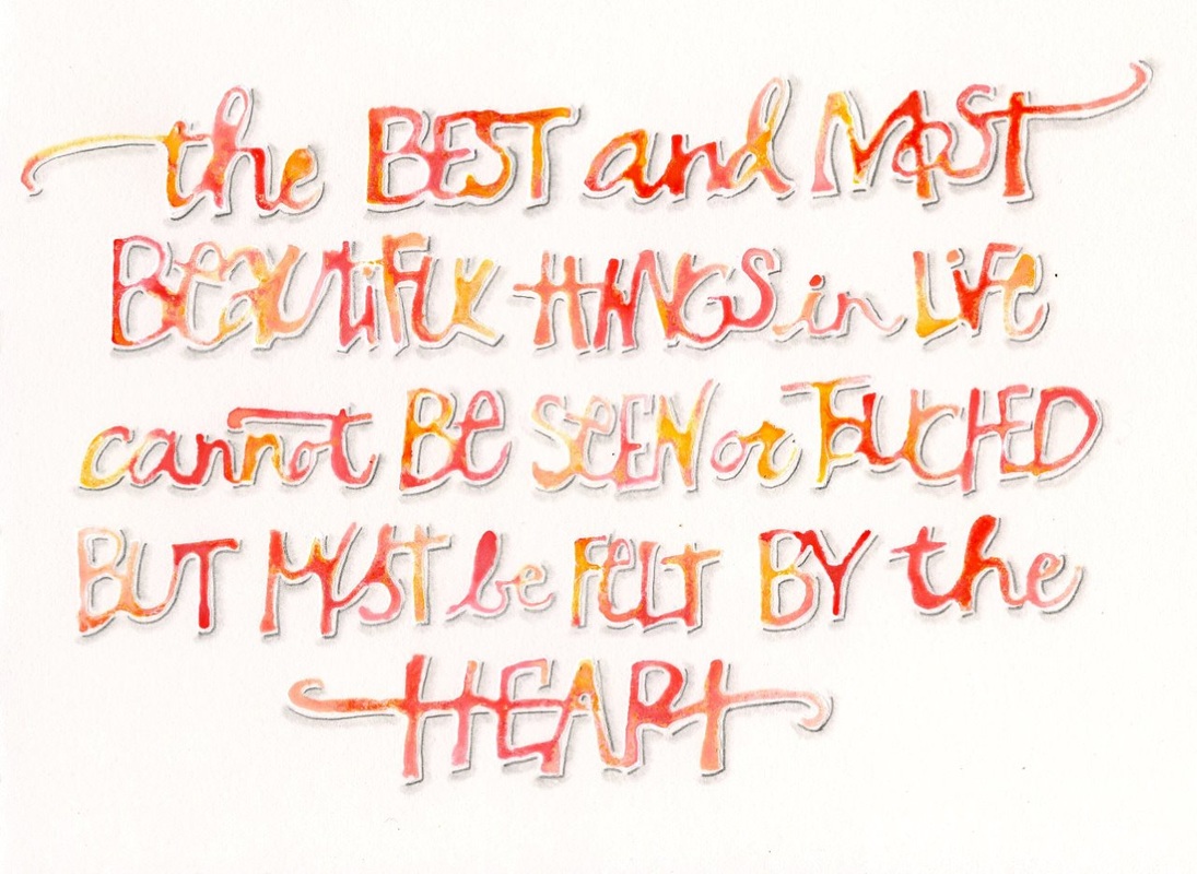
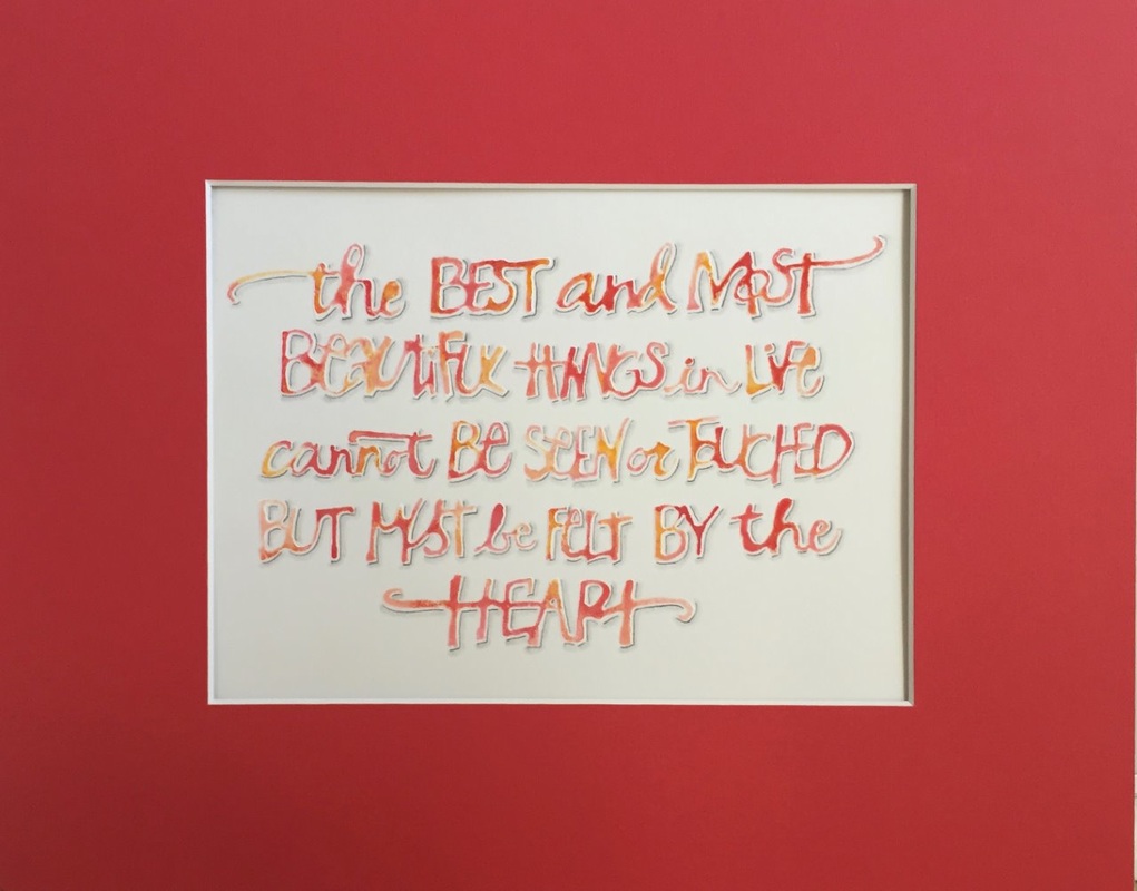
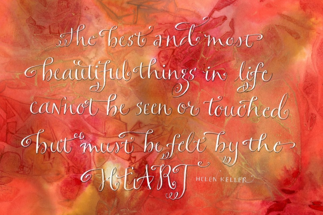
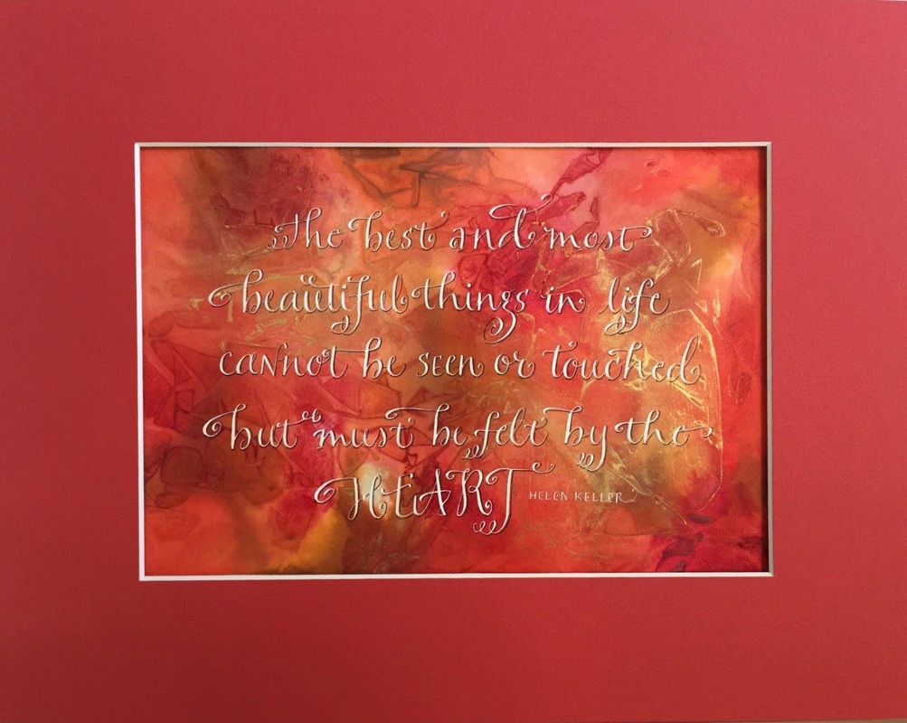
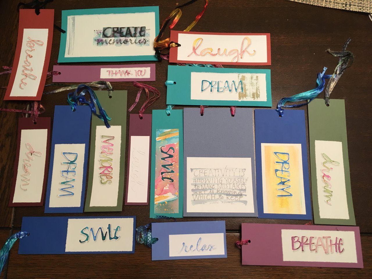 It is fun to create a simple bookmark or tag to add to a gift. I enjoy adding the shadow to make the lettering look 3D 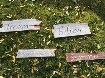 I was fortunate to be given some barn wood and have enjoyed working with my wonderful daughter in law to create unique barn wood signs. The possibilities are endless! Red mats were suggested for these two wedding presents. I loved the pop it added! This was done with bleedproof white ink with colouring dropped in while the white ink is wet. I added a shadow after it was dry for a 3D effect. Pointed pen lettering on a watercolour background, again with bleedproof white and shadowed. I love the different effect with the same quote.
|